The “mobilegeddon” craze has subsided, but just because your website is now considered to be “mobile-friendly” by Google doesn’t mean it’s actually friendly to users. Sure, the font my be easier to read, but is your website is optimized for effectiveness?
“Effectiveness” is a little vague, so let me elaborate. We want our mobile site to generate leads, and in order to do this patients need to be able to: a) find exactly what their looking for, and b) quickly and easily contact you via phone or email. In this article I’ll outline a few tips to address both of these concerns.
1) Configure the sidebar to ‘respond’ below the content: Most websites have a sidebar that includes a variety of different “widgets.” These include, but are not limited to, web forms, navigation menus, social icons, and accreditation logos. A mobile screen is too small to fit a sidebar so it has to stack the page content and the sidebar, meaning these sidebar items will either go on top of the content or below it.
In almost every case I’d recommend these widgets go below the page content. The reason is that if you put them on top it’ll push this content very far down on the page, requiring a lot of scrolling to get to the ‘meat’ of the page. This is cumbersome and will lead to high bounce rates. Before you say, “well what about having a call to action at the top above the content?” let me point you to #3 below.
The only instance where you could consider not stacking the widgets below the content is if you custom coded these pages to show some widgets and not others. In this case, the widgets showing above the content would have to be relevant, such as a sub-navigation menu, and take up little space. Still, as I mentioned, this requires additional custom coding that may not be worth the time and effort.
2) Easy-to-use navigation: This one is self-explanatory, but often overlooked. Most aesthetic practices offer quite a few different services, and each of these services has it’s own page (or at least it should, for SEO purposes). While you may have a very well-organized navigation, having a lot of pages to show on a small screen can be difficult. You don’t want to use the “scrolling wheel” that many sites incorporate unless your navigation consists of 5 or less pages.
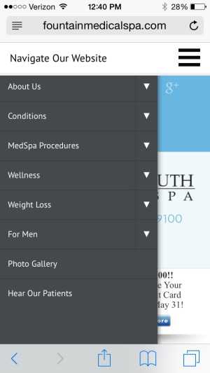
The good news is that you have options. You can configure your navigation to open up on the side of the screen or full screen, with arrows to use to open up drop down menus. Just remember that you should aim for two layers of navigation and definitely avoid more than three layers. If you happen to have three, such as Surgical > Face > Rhinoplasty, make sure that on the desktop you can access the rhinoplasty page directly from the drop down menu, and on the mobile site you can access this same page by simply tapping the Surgical, and if necessary, the Face category buttons.
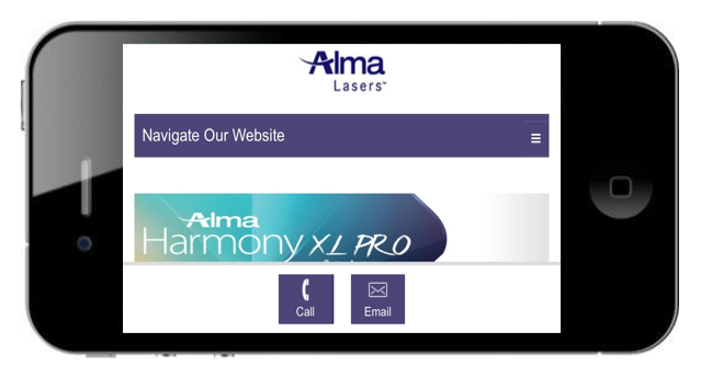
3) Implement “sticky” icons (calls to action): This one is my favorite. We talk all the time about the importance of the call to action in generating leads. If you’re pushing your widgets (which includes your web form) down below the content, as noted in #1, how can we maximize lead generation?
“Sticky” icons are one’s that remain either at the top or the bottom of your screen no matter how far down on a page that you scroll.
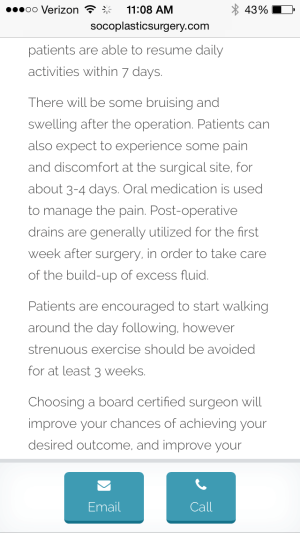
So what exactly are these icons? Where do they link to? You’ll definitely want icons that allow people to either call or email you. You’ll also want an icon for your menu. If possible, consider an icon for either your photo gallery or your reviews page.

These are just a few ideas to make sure your mobile site is running effectively. If you have any additional ideas or tips we’d love to hear them. Feel free to leave a note in the comments.
If you’re unsure if your website is mobile-friendly you can use this conveniently Google tool. Remember that even if you pass the test your website still may need some work. To learn more about how you can improve your mobile website simply leave TRBO a note here or call us directly at 877-673-7096 x2.


