
 I recently wrote an article about improving your website’s UX and I want to focus on one of the specific topics mentioned in that article: your website’s navigation. For most aesthetic practices the challenge is how to simplify your navigation, but for others just organizing it can be difficult. What to add to your “main” navigation vs. sub nav? Should I have two navigations? How do I display the menu on mobile devices? These are some of the questions I’ll clarify in this article, focusing on improving each patient’s experience (and limiting their frustrations).
1) Organize: whether or not you have a sitemap in place it’s helpful to take a step back and evaluate your website’s organization of content. Start by organizing your procedures into parent categories. Separate surgical from non-surgical (or “med spa”) and then look at the areas treated: face, body and breasts, for example. Make sure you have this hierarchy mapped out.
2) Simplify: once you’ve organized then you need simplify in order to fit no more than 7-8 links in your main navigation. I recommend you look at your Google Analytics to see which pages people are currently clicking to once they enter your website, keeping in mind that your current structure may influence these clicks. For a comprehensive practice, with upwards of 50 or more surgical and non-surgical procedures, one way to simplify this is to list: About Us, Surgical, Non-Surgical, Photo Gallery, Patient Info, Blog and Contact Us. You could even fit in “Financing” or “Specials” into the main navigation. Doing so may require shortening the name of some links, such as “About” instead of “About Us” or “Gallery” instead of “Photo Gallery.”
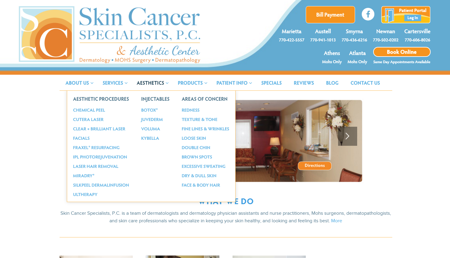
3) Effective Drop Down Menus: if you’ve followed the example navigation mentioned in #2 then you likely need several different drop down menus, which is fine. However, you need effective drop down menus. Instead of having the Surgical parent category open up Face, Breast and Body and then utilizing a sub-nav to get to individual procedures, allow patients to easy see the individually procedures all in one, single drop down, like the example below:
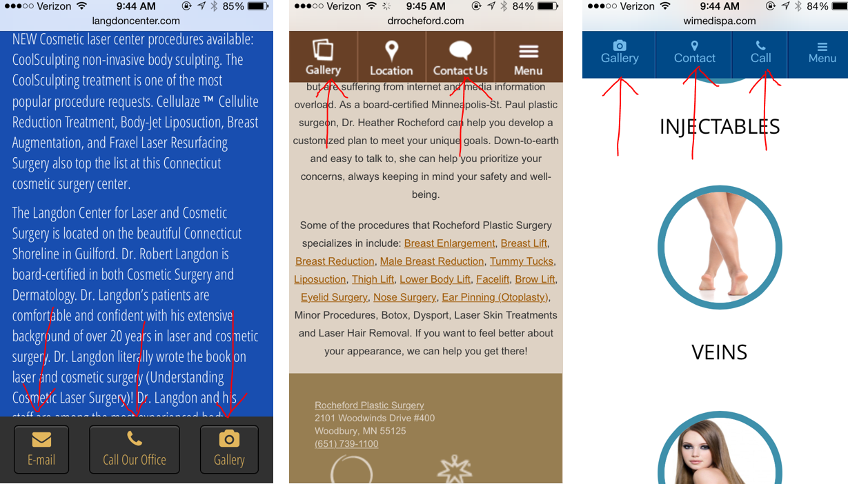
4) Think Mobile UX: Unlike the desktop version of the site, which should show individually procedures in the drop down menu (like the screenshot above), you can’t do that with your mobile menu. You’re a little more limited in customizing your mobile navigation, but you want to make sure it’s easy to find and easy to open and scroll. For your most popular pages, such as your photo gallery, I highly recommend working it into a “sticky” header or footer so that patients don’t even have to open your menu to find it, like the examples below:
Some websites have two navigations, one that’s in or above the header and another that’s below it. The latter one usually has the drop down menus, while the former simply has individual links. This layout is fine, and sometimes necessary, but you need to think about how these will display on mobile devices. Having to open two menus on a mobile phone to find what you want can be a bit cumbersome.
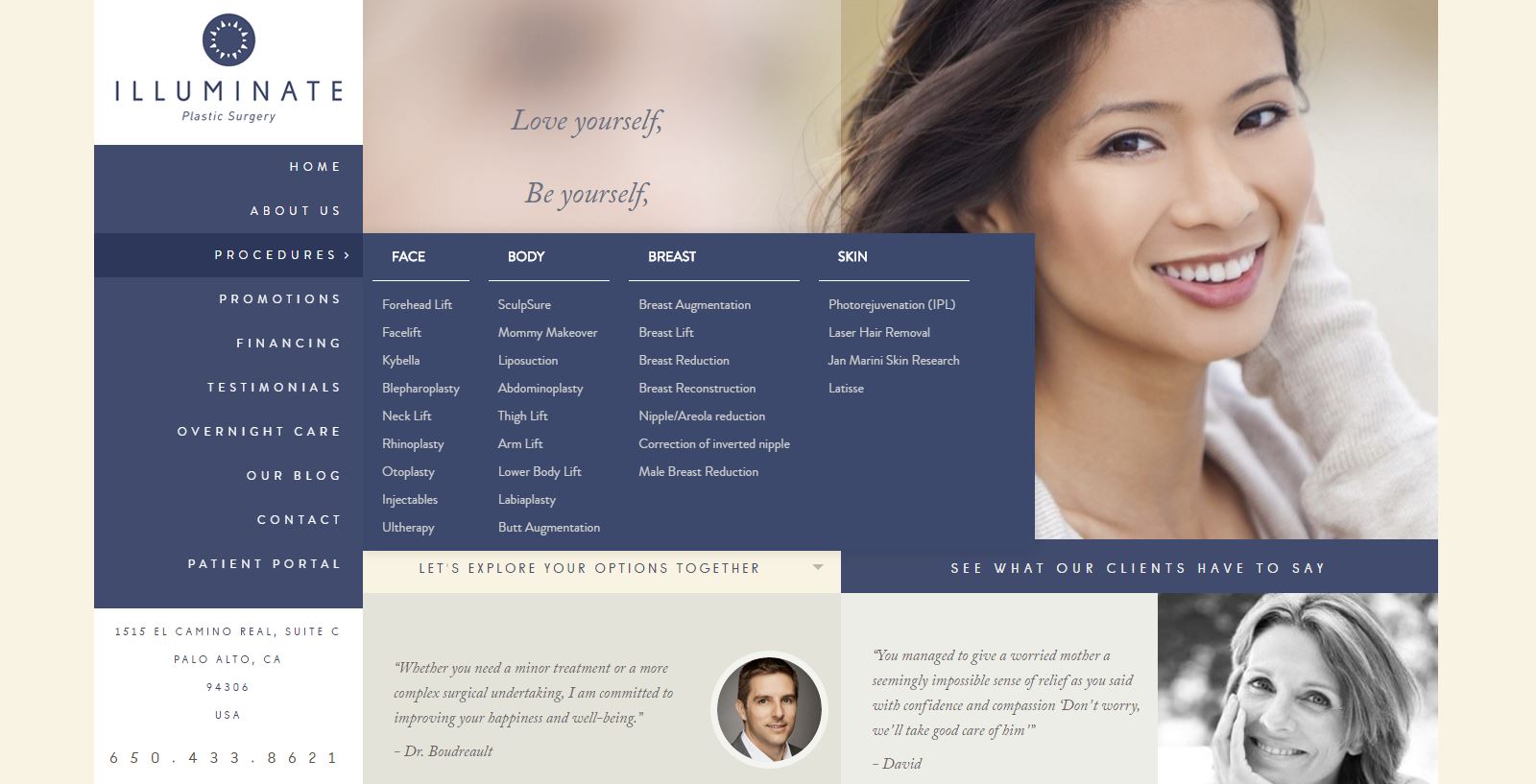
If you’re thinking outside of the box and want a side navigation, as opposed to a more traditional horizontal nav at the top of your website, it is possible for this to look good and be functional. You just need to keep the organization, simplicity and drop down menu in mind. Here’s an example of a website that does that well:
If you have questions about how to improve your navigation, or you want to overhaul your website, then give TRBO a call at 877-673-7096 x2 or drop us a line here.


