 We’ve recently completed a website re-design for our client Levy Dermatology. Lead by board-certified dermatologist Alan Levy, MD, the practice has two locations in the Memphis metropolitan.
TRBO has worked with Dr. Levy and Levy Dermatology for about a year, but this was the first major website design update we’ve made. When the practice fist signed up with TRBO we implemented a UX makeover based off of a templated design. It was an improvement over their original website, but this latest project involved a completely custom re-design.
Our goal was to up re-design the website to give it a more modern, professional look, with improvements to the procedure page layout, navigation, and mobile interface. You can click here to visit the new website. Here are some of the features of the new website, which we developed on WordPress:
- fully custom design
- fully “responsive” layout with “sticky” mobile calls to action
- parallax page components
- improved navigation
- Turbo photo gallery
- social media integration
- full search engine optimization
- blog integration
- web forms for improved lead generation
- fully secured via SSL
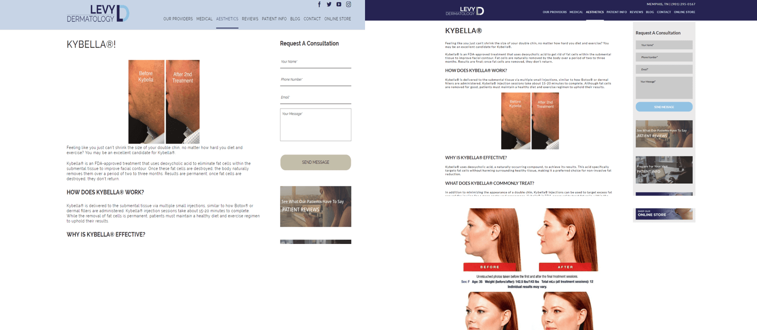
You can see some of the improvements in the after photos below. The old website wasn’t in terrible shape, but we really wanted the new design to “pop.” While the old website was “responsive,” we wanted to improve the calls to action to grow the mobile leads, especially since the website received over 63% of its traffic in 2017 from mobile devices.
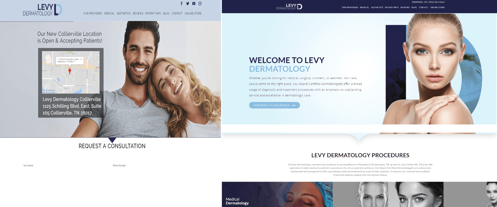
The old inner pages were decent, the copy was solid and they had conversion elements, but we wanted to add better social proof within the copy. Additionally, we beefed up the sidebar and on-page calls to action.
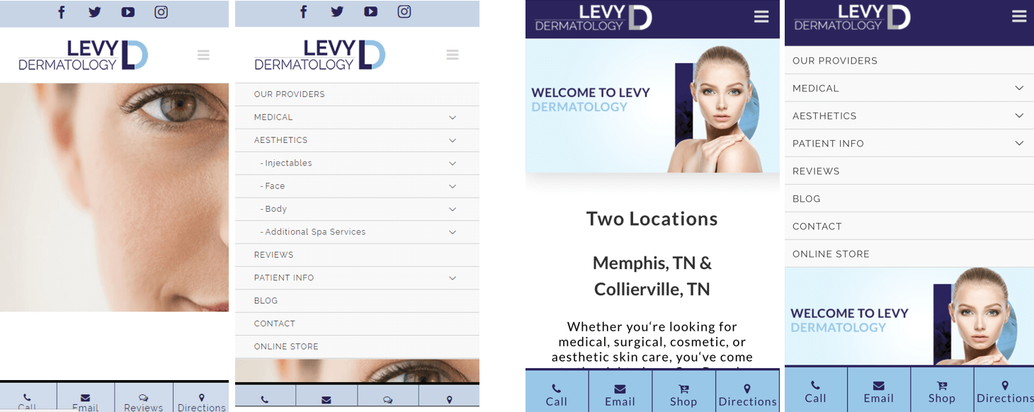
The old website was mobile responsive, and it also showcased the TRBO Sticky Footer, so the primary calls to action were already in place. However, like the desktop site, both the home and inner pages on mobile needed subtle tweaks to the layout since not all page elements look great when they “respond” to a smaller screen. You can see that the menu didn’t need to change, but we made adjustments to image sizes and tried to cut down on long paragraphs as they appear very text-heavy on mobile devices.
If you’d like to see a breakdown of all our most recent projects click here, or you can check out our portfolio of website work here. If you’d like to learn more about WordPress conversions, or re-designing your existing website, then send TRBO a note here. You can also reach us directly at 877-673-7096 x2.


